Yama,the entire form structure and markup really needs to be overhauled, and probably some consideration given to what goes in which tab.
Ryan Thrash, MODX Co-Founder
Follow me on Twitter at @rthrash or catch my occasional unofficial thoughts at thrash.me
-

- 718 Posts
I like wordpress style.
Switching between html and rich-text editor.
-

- 7 Posts
Hi,
I have another tentative suggestion to improve usability.
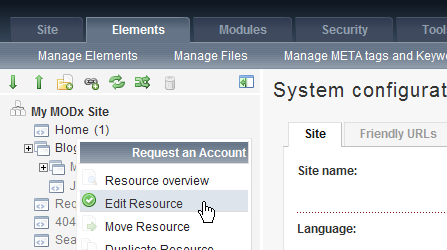
When you click on a resource in the site tree, you currently get the ’View Resource data’ page. It might just be me, but I don’t think I ever use the information on that page, I always click immediately on ’Edit’. Of course, you can edit straight from the drop down menu, but again, that is 2 clicks. If I’m working on the site for a while, that is an awful lot of extra clicks.
I think usability would be improved if clicking on a resource took you straight to EDIT. The information on the View Resource data page could be given in tabs on the edit page.
What do people reckon?
-

- 535 Posts
Quote from: bthuddo at Aug 10, 2009, 09:47 PM
Hi,
I have another tentative suggestion to improve usability.
When you click on a resource in the site tree, you currently get the ’View Resource data’ page. It might just be me, but I don’t think I ever use the information on that page, I always click immediately on ’Edit’. Of course, you can edit straight from the drop down menu, but again, that is 2 clicks. If I’m working on the site for a while, that is an awful lot of extra clicks.
I think usability would be improved if clicking on a resource took you straight to EDIT. The information on the View Resource data page could be given in tabs on the edit page.
What do people reckon?
My opinion is : from the user point of view, this is a little modification with a HUGE impact on usability.
I never use the "data page" too and if it happen , I damned myself..
CTRL+SHIFT+U - Clear Cache
CTRL+SHIFT+H - Hiding Heft Panel
CTRL+SHIFT+N - Fast Create Resource
CTRL+ALT+P - Preview Recource (in edit resorce window)
CTRL+ALT+S - Save
-

- 898 Posts
I also agree. This would make things much much simpler for clients. It seems silly, but i think it would be a great improvement.
 ☆ A M B ☆

 MODX Staff
